
NUK Reborn
Global Packaging System & Brand Refresh
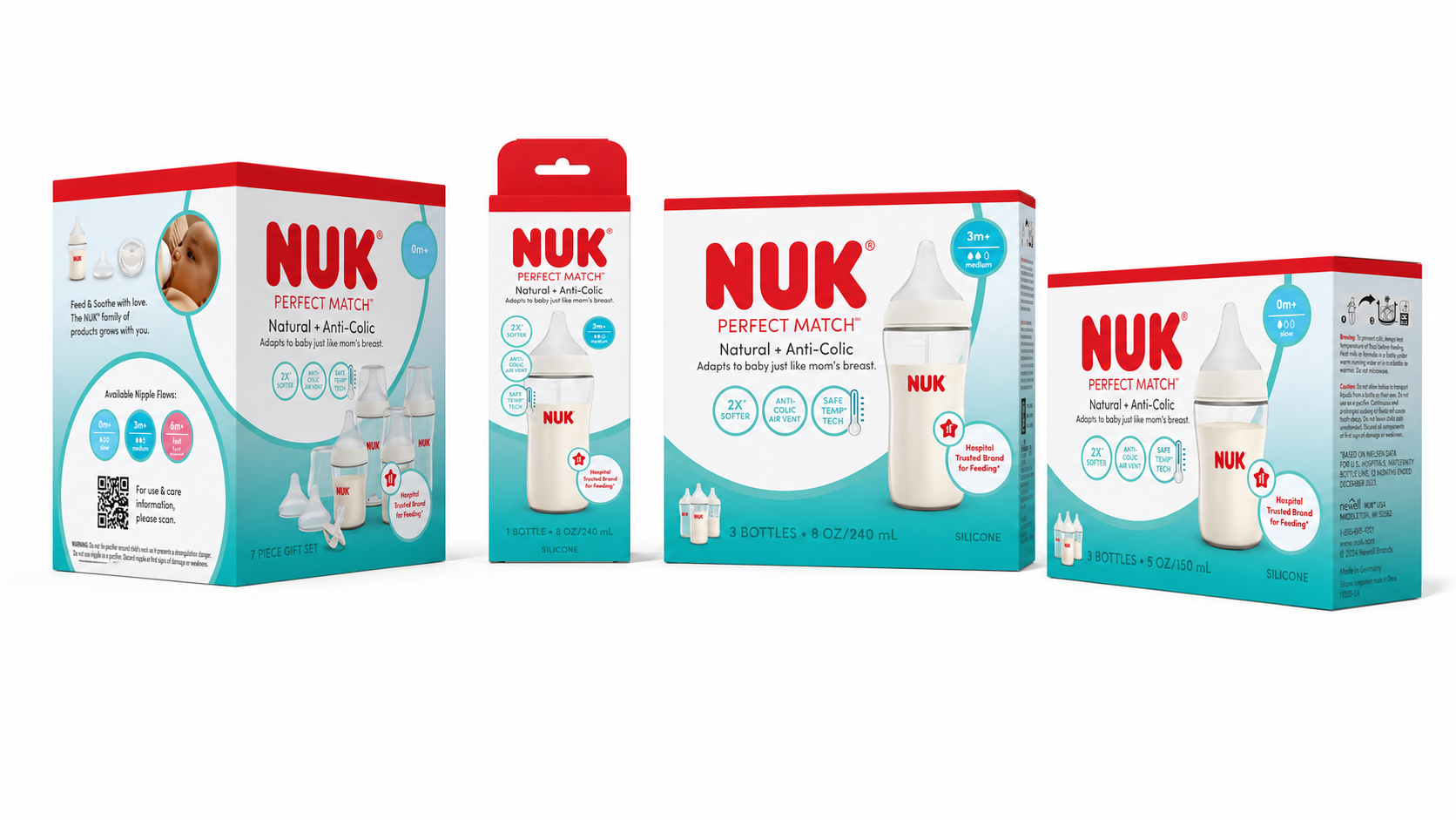
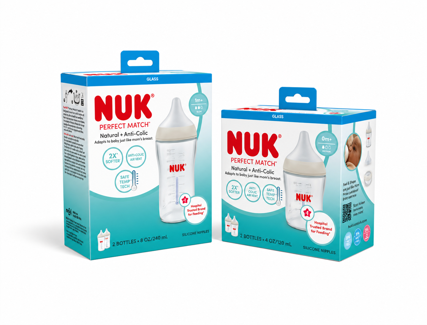
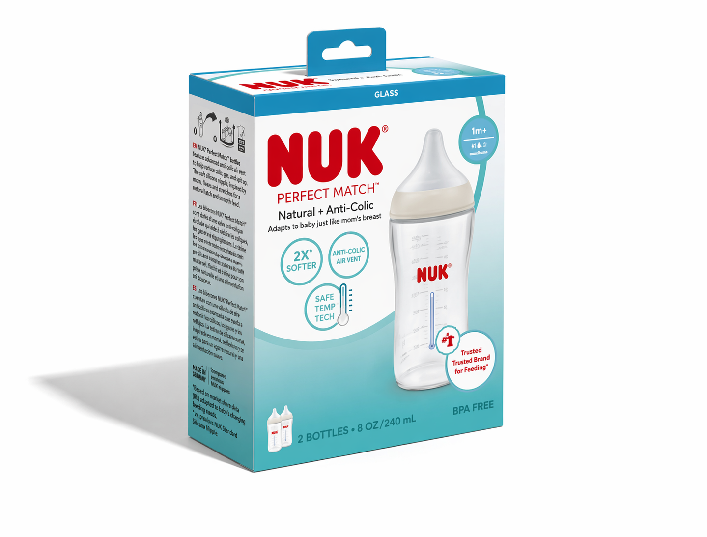
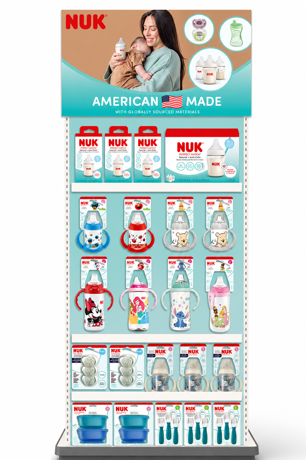
I led the design and rollout of a scalable packaging system for the 2026 NUK Reborn brand refresh, supporting the global launch of the Perfect Match line and a broader repositioning of the NUK brand.
Challenge
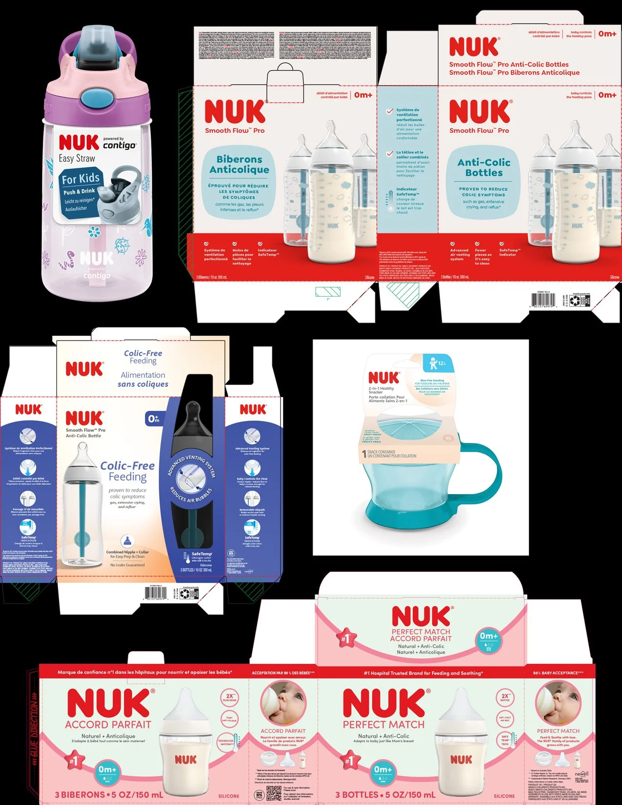
NUK faced declining market share and fragmented brand presence across regions, driven by inconsistent packaging, weak shelf differentiation, and a lack of cohesive brand identity.
The portfolio spanned hundreds of SKUs with disjointed visual execution, limiting scalability and reducing impact at shelf.
Approach
Developed a modular, system-driven packaging framework to unify the brand across global markets.
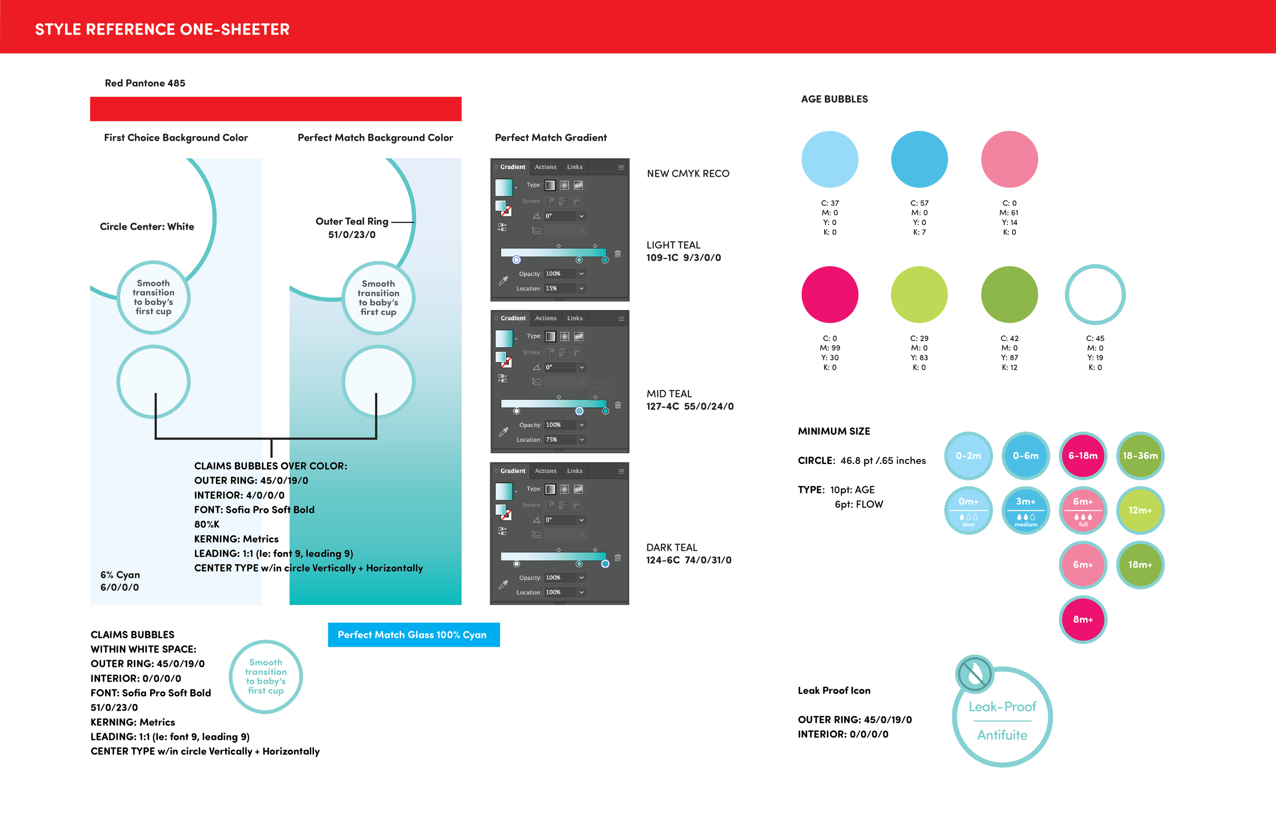
Standardized typography, color systems, and information hierarchy
Created a scalable structure to support multi-SKU expansion
Collaborated with global stakeholders, including Germany-based teams, to align on brand direction
Led weekly design reviews to streamline feedback and maintain consistency
Solution
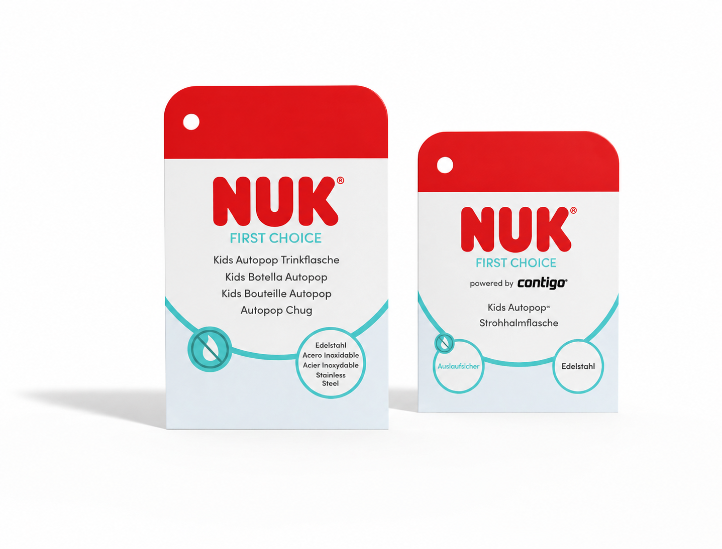
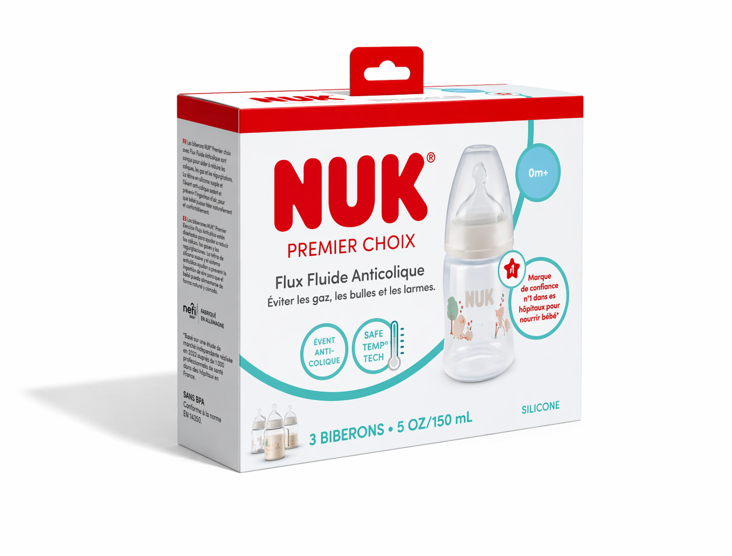
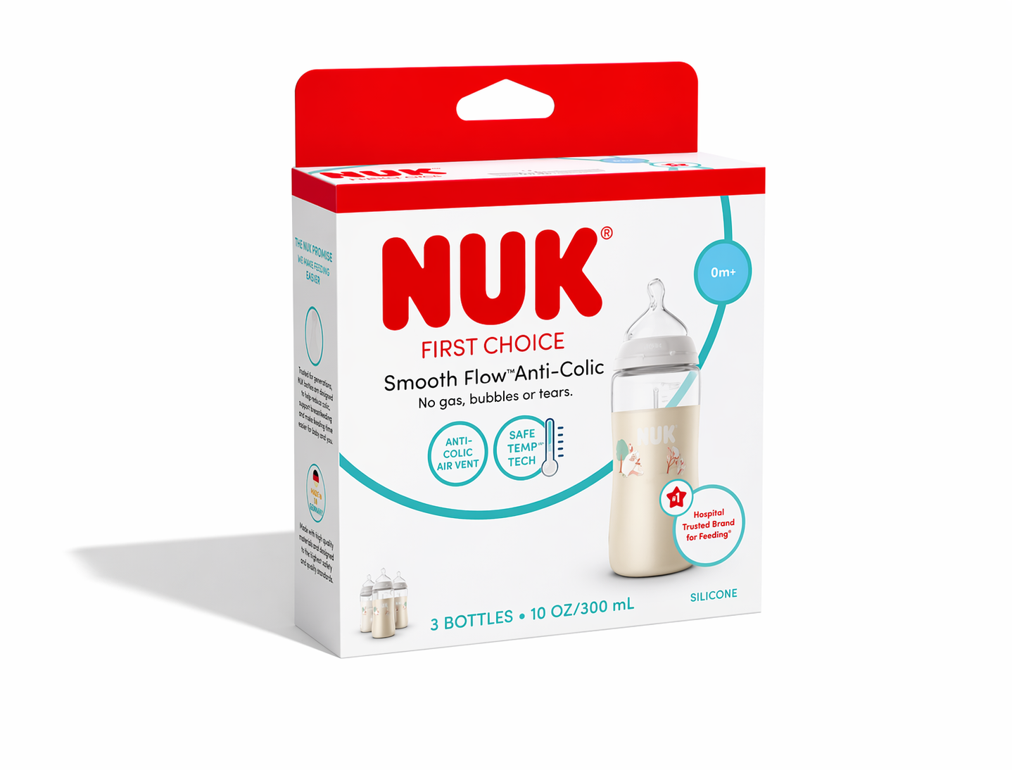
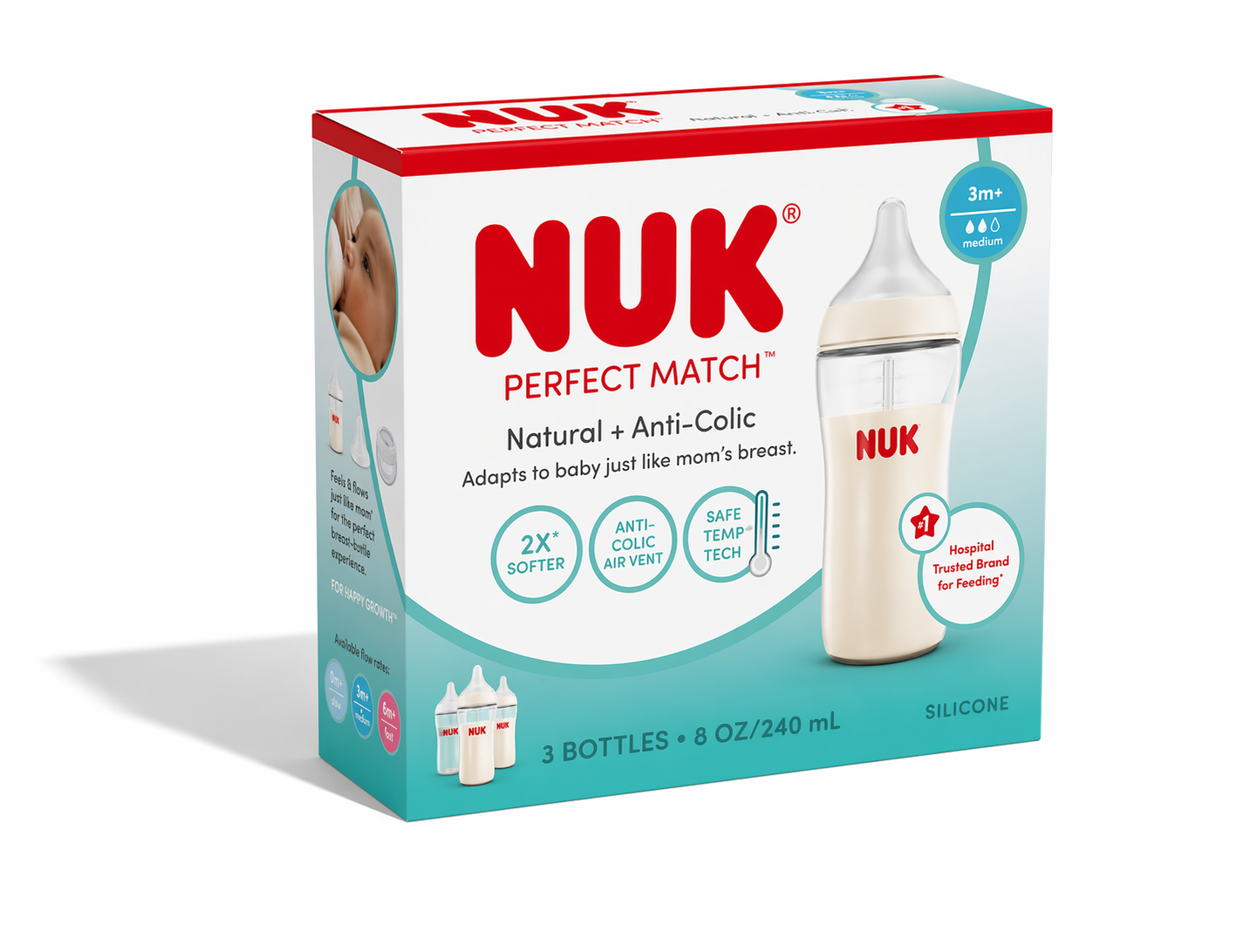
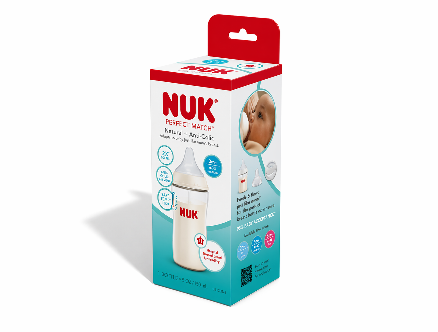
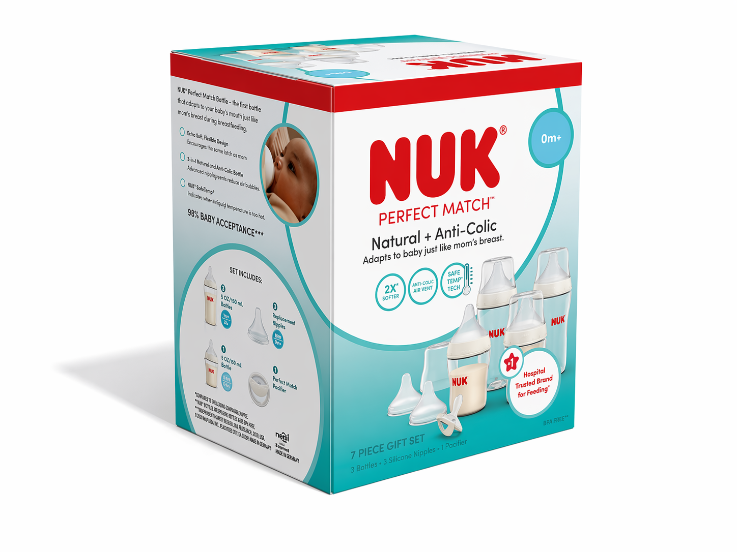
I Delivered a cohesive packaging system applied across 60+ SKUs, forming the foundation of the NUK Reborn brand refresh and enabling consistent execution across retail and digital channels.
Impact
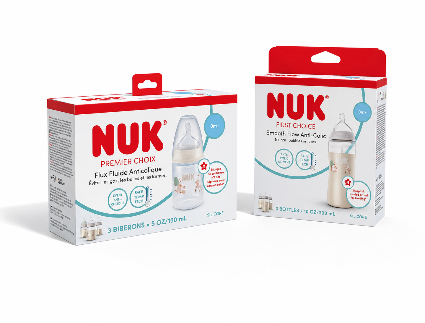
60+ SKUs launched under a unified global system
Strengthened shelf presence and improved product clarity
Established a scalable framework supporting portfolio simplification and future growth
Enabled more consistent brand expression across regions, supporting broader brand repositioning efforts